
Hey folks, thanks for sticking around for this, I can't wait to show you all the cool drawings that have happened in the last month or so. Having said that, without further ado I finally present the color portion of my tutorial.
Yet again, this tutorial isn't geared towards someone brand new to the world of drawing/coloring and of caricatures, but rather intended for those with some understanding of those elements. I would also like to start out by saying that the process depicted is not the exact same process I use every time. There are times I mix things up and try new things, this allows me freedom to change and experiment. I would also like to add that I don't always go through this much work for every sketch. There are many occasions where time is a factor and short cuts must be taken.
There are tons of customers that want something real quick, real simple, real cute, and often times wont have any signs of a likeness, simply put, they just want something to shut the kids up. In any case, learn to read your customers, find out what they're really interested in, if they're simply in a hurry and don't really care how well it comes out, don't waste your or their time. There are tons of ways of achieving certain looks without having to go through as much process, but if you have a model that wants something of quality and you want to "try a few things out, " see what this process could do for you.
There is another thing I would like to mention. For many years, I would try to press really hard on peach colors and various (base) skin tones to achieve an illusion of depth. Eventually my right hand would begin to cramp up and hurt on a much more regular basis. Besides that, I was never pleased with the end result and always felt there were missing components that could make the forms pop much more. So, in search for another method I looked toward my fellow peers for ideas. I then noticed the way my friend and great artist, Nick Mitchell, was layering on various colors such as indigo, tuscan reds and other various colors I never gave much thought to. I also noticed my boss, Dion Socia, using various principles of color theory to achieve shadows, such as applying the complimentary color to something (blue with orange, green with red....etc). I then noticed one of our visiting artists, Alex Clare, was laying down pinks first before he would add the peachy/flesh color.
All of that had me thinking of various ways to create my own brand of solutions. I began recalling all of that useful knowledge I gained through art school and realized, why don't I just apply those practices towards my drawings? Thus, this current color process was born.
The materials used for this tutorial (and that of Kamans Art Shoppes) are the Prisma Color Art Stix and a thin foam pad. The Prisma Color art stix are an excellent coloring medium. It's essentially a 3.5" in length hulk of waxy pigment, a colored pencil without the pencil. I sharpen the edges or round them off to allow more versatility such as creating various gradations and for covering large surface areas. These Art Stix can be found at practically any art store and will run you about the same amount of cash as a colored pencil. The foam pad I mentioned is simply a thin piece of craft foam that can be thrown underneath your drawing to allow your colors to have a softer gradation, and can be found in any craft section at Walmart or Michael's . Depending on the weight of the paper, try throwing a few sheets of paper between your drawing and the foam, this way you can allow more texture for the color to grab onto.

For those of you just joining me, this my model, Ashley Gaia. Take a second to look over the various colors you see that make up the color of her skin. Also, try and determine where your sources of light are. Natural light (such as this) has a habit of being reflected everywhere. It's much more difficult to recreate rather than something using only one or two light sources.
A trick I often use to find the main shapes and shadows is to simply squint my eyes. By squinting and affecting your vision, it's easier to see the big picture rather than all the details cluttering things up and making it difficult. Another method I've seen used is to back away for the subject or create distance between you and you subject so that it becomes blurred. This allows things to be broken down into the very basic shapes and various details and lighting complications should fall in it's place after your core lighting is established.

Now for the real color! I often start off with using some sort of dark brown color, like burnt umber, to establish the main shadows. In essence, this creates a sort of gray scaled version of your drawing. This step may be the most tricky, but once the shadows and forms are more defined, the rest is relatively easier.

To compliment the warm lighting that covers the majority of the right side of Ashley's face, I cool down the shadow area with various blues or greens depending on the colors I see. Keep in mind that although it may seem ridiculous to throw in colors like blue, green, aqua, purple, it really isn't. Skin is a relatively translucent material and allows colors to not only be shown through it (such as blood and veins) but also allows colors to be reflected as well. Take a look at peoples' skin sometime and REALLY analyze the the various colors besides peach, tan, and pink. You'll find that a lot of the surrounding/environment colors are being reflected throughout the skin, such as the green from the plants and the yellow from the cart. True, most of these colors are too subtle to care about, especially in a theme park caricature. All I'm really stating is your color pallets shouldn't be so limited. There are many colors shown throughout a person's skin, don't be afraid to experiment.
Another thing I would like to add is that when applying the color, it's not necessary to grind down or press hard on the paper, allow the color to do the work for you.

Here's more about that translucent talk again. I use various pinks and blush colors around this point in the drawing. I figure out were most of the blood has reached the surface like the noses, nostrils, eye lids, lips, cheeks, ears, foreheads, brow ridges....etc.

These are also the areas in which most people get a lot of sun, so indicate sunburns as well. Remember, you don't have to be pressing down hard on the color at all, once the shadows are laid down, you're simply tinting the drawing with color.

Now I hit it with a type of golden rod color. Depending on the face of course, there can be a lot of warmth and tan like qualities to the skin. I sprinkle this color around to various areas I see it on the model. This also helps get rid of a pale, dead look to someone's face. Also, I find it best to shade and color FROM the shadows and move towards the areas where light is hitting the surface. That way you establish more a uniformed layering method.

Now for some tuscan red. With this color I use it only in certain areas like the nose, the area between the nose and the nostrils, and to establish more shadowed areas of the lips. This color is also effective to draw out more prominent sun burns as well.

And we finally reach the color peach! At this point I've already made a strong enough base of colors without even touching this color. Primarily I use this color for 2 main reasons. The first reason is to fill in a bit more of the white areas that don't need to be so white. Like for instance, to capture a more sharper highlight on the nose.

The other reason is to blend and pull in all the colors previously laid down. At this point in the color, I actually do apply a fair bit more pressure so that it actually pulls and drags the colors a bit more. At this point now, the skin color is pretty complete unless you see something that should be enhanced a little more ( like shadows, or redness..etc).
This is something fairly new to my process, and that is the usage of the 10% and 20% cool gray markers my Prisma Color. They are excellent at putting down clean and crisp shadowed areas, like under the jaw, nose, eye lids, underneath the breasts...etc. I especially love using these in the "whites" of the eyes. One of the greatest moments I had when drawing eyes, was that I noticed that there are no real whites of the eyes, the closest thing to white, would be the shine, or reflections. So, in order to achieve that look I use a little bit of the 10% cool gray around the iris to help really pop out those highlights, then I finish the job with a 20% cool gray underneath the top eyelid for a great shadow effect. Also, since I'm talking about eye color, I think it's also good to mention that when coloring the flesh, it's alright to have some of the color get into the "whites" of the eyes. If you really look, you'll see SO much flesh and blood colors in the eyes, and will not only make them pop, and look more real, but help tie in those colors a little more.
Another great benefit I've found is that if you wait to apply the Prisma Color markers LAST, it will smooth and blend colors extremely well. This can also help if you want to create more diverse textures as well.

There are some colors simply not offered in the Prisma Color Art Stix line, so colored pencils will have to do. This brown, however, is part of that line, but much easier to use for smalled end details such as Ashely's small eyes (in comparison). I find that when coloring eyes its best to saturate and make darker the area beneath the upper eye lid and and around the outer edges of the iris. It's best to keep the area around the pupil as light as possible to help create a more milky and translucent eye color.

This, I admit, is a bit excessive, but what the hell. This is a pen/marker I saw at the local Walgreen's photo center. It's a photo safe, acid free, opaque gold marker (also comes in silver) and cost $2. This pen works great for that gold effect as long as you keep the white of the paper as the highlights to whatever it is your coloring. It's also great if you're rushing through a drawing and you don't want to concern yourself with leaving enough space for the jewelry, you can use this to flawlessly color right over your line later and save your self some drawing time (more of that cutting corners thing).
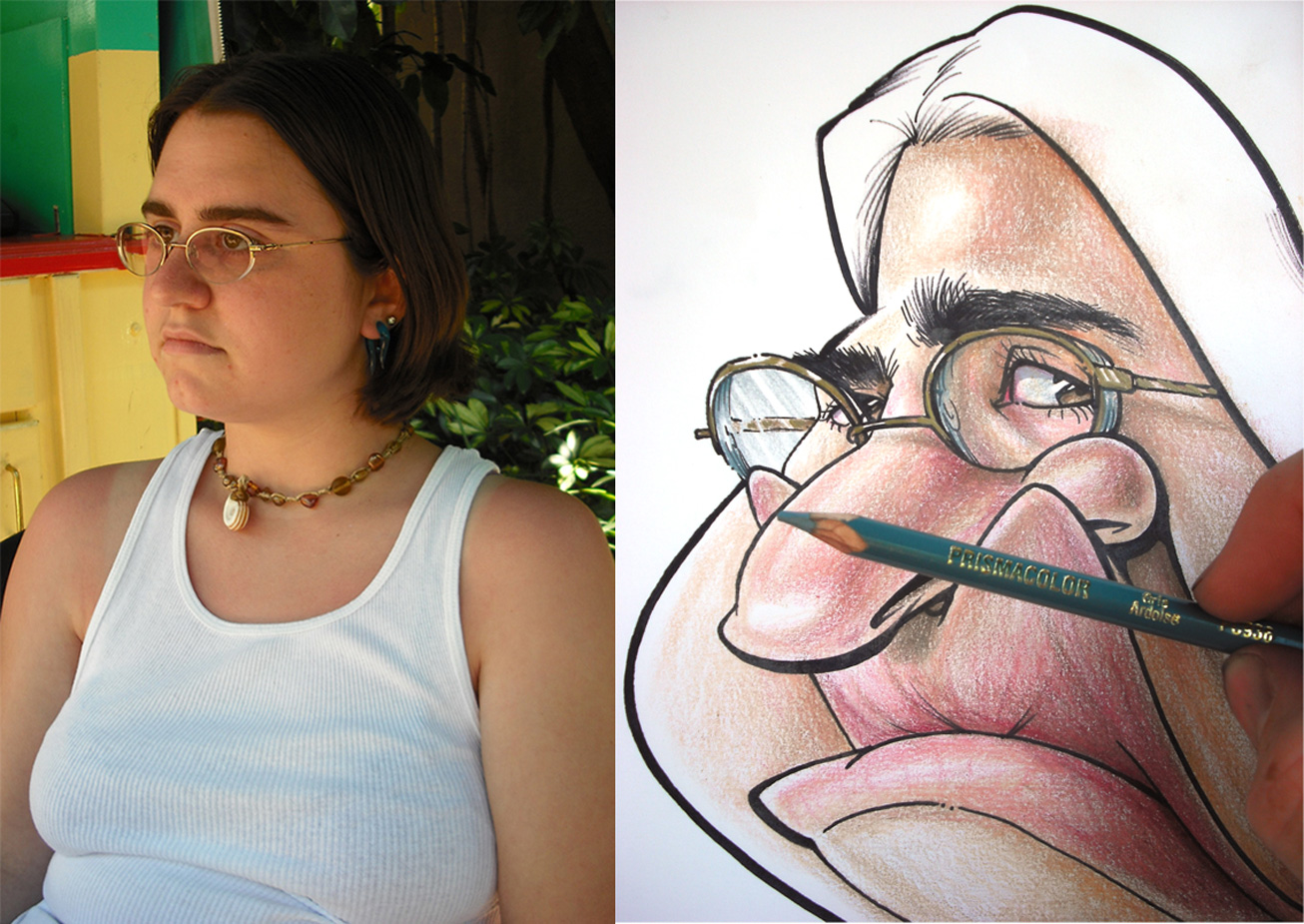
Some times I use this instead of the cool gray markers to create certain effects, figure out what works best for you. Here I demonstrated it's effectiveness in the eye glasses.

Onto the hair portion. Obviously color what you see, use what you feel would be the best colors. Warm it up with the golden rod, or cool it down with a dark brown. I generally layer from light to dark for hair, but choose whichever way works best for you. The one thing I do try to keep in mind are the highlights of the hair. This will help really create the illusion of form and lighting.

Continue to layer on the darks until you're satisfied. Also, using the same methods, I colored in the shirt accessories.
Last but not least, add some splashes of color to help pop the figure from the background. As a general rule I try and use colors that have been used in various areas of the drawing. Its also best to use colors that weren't so obvious (like peach, gold or pink) but perhaps the color of someones eyes, or in this case I could have gone with various greens (used on the beads in her necklace). In this particular drawing, I used a cool blue shade to compliment the warm colors in her face.

TADA! There we go! An all out rendered caricature!! Like I said earlier, this process isn't used every time, but this was just to show examples of various ways to layer color. I'm constantly looking for new things to try out and other methods that could suit me better. If you have any, please feel free to email me at artist53an@yahoo.com, or comment on this post for all to see.
I hope you found at least something useful or perhaps challenged your process to experiment as well. Happy sketching!