First off, I want to apologize for the extremely long wait for this. The past few weeks have been absolutely CRAZY for Sheina and I. We’ve been planning (for months now) on moving up to Pennsylvania this week to study make up effects. Unfortunately, we were unable to on account of securing student loans on time. So, with that idea (and constant preparation) shot down in a fiery blaze, I am now able to return to live a normal caricature life again. All of that aside, but I’m pleased to announce my first drawing tutorial.
After much consideration I’ve decided to go about instructing this as though you already area caricature artist, and already have a concept of observation and exaggeration. The reason being, is that this would turn into a full fledged instruction novel, rather than a blog post. If you are looking for the art of seeing and understanding exaggeration, check out Dion Socia’s anticipated DVD (due out this year), or look at fellow caricature artists (some links provided in the top right side of this blog). Study them and find the connections between the subjects and drawings.
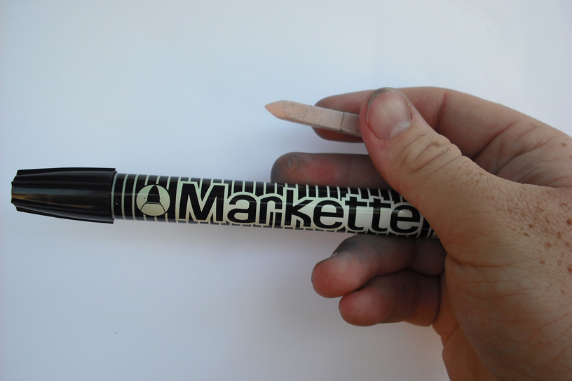
These are the materials I use during the drawing portion. I use a pale flesh color Art Stick by Prismacolor for all of my under sketching. The reason for this is so I can draw directly on the paper. It’s barely visible, but it still leaves behind a guide that I can return to.
Often times artists create an under sketch using the marker and throw it underneath. Although that is a very effective process as well, it often times allows your audience to see exactly what you’re going to do, and loses a lot of the punch. The flesh color technique uses less paper and makes anyone watching totally baffled while you sort things out. The other tool I use is a black Markette by Dixon. I like using this marker rather than a brush tip because I feel I have more control and there is less room for error. This is just my personal preference. Markettes have a stiff point, yet allow for a wide variety of line weights to be accomplished by using various angles, such as holding the marker at a more vertical angle to create thinner lines.


The next order of business is to quickly study your subject. Don’t be afraid to ask your model to look in different directions. Take advantage of having a live model by being able to view many angles. Often times we only see ourselves straight on by looking at the mirror. By being able to view them from the side or ¾, you capture them at an angle they aren’t aware of and how they are usually seen day to day.

This is that pre sketch technique I mentioned a while back. For the sake of the tutorial I have used an indigo blue instead of my pale flesh so that it can actually show up in the photos.
I would like you to keep in mind that for the sake of time, I do not always use this much process on every sketch. The purpose for showing these steps is to show the various ways to translate observation.
Often times I will quickly sketch out the simple placements and shapes of my composition, and sometimes further pre sketching is needed if I feel there are some things that need additional clarification (such as features that overlap ...etc). There’s always only one pre sketch, but to clearly show my process I’ve designed a few examples of different types of pre sketches. At most, pre sketches should only take about 15 seconds, so just make it quick.

YAY! The drawing! I always think of drawings in layers, moving from the top layer (the foreground or closest feature) and move my way to the bottom layer (the background or future feature). This method allows for a greater illusion of depth. I’ve seen other artists use a method of working from the outside in. The problem I see with this, is by starting with the jaw, cheeks, and hair, you trap yourself from exploring the length, shape and size of those wonderful features. I prefer to work from the inside out.
Generally I start at the center (the nose) and work from there. It’s usually the feature that sticks out the furthest and also allows you to lock down your final angle. Once you have your angle secured, you can then align the remaining features accordingly. I’ve chosen to draw the tip of the nose first and then the bridge, thus determining the angle in which to draw the rest of the face. I have also chosen to exaggerate the shape and curve of her upper lip to overlap her nostrils. As so, it would logically be the next feature to draw in terms of the faces natural layers. Continuing on with the nostrils (that would be behind her flared upper lip) and then down to the corners of her mouth. Here I’ve noticed that her upper lip seems to dominate the corners of her bottom lip as well, so they would be drawing next in the sequence, and so on and so forth

Onward to more features! Continuing on with moving from front to back, I’ve reached a point in which I could determine the sides of the face. Had I drawn her cheeks first I would have been stuck drawing her bottom lip inside. True, it was drawn within the cheeks anyway; at least I had time to determine that once I felt more comfortable with the length and size of the other features. I have left the top portion of the face blank so I can figure out what to do with the glasses, brow and forehead.

The Glasses! This part can be tricky. There can be a lot of lines and perspective issues. Keep in mind the angle in which you’re drawing, and things should fall into place. Broken lines can be very effective when trying to convince highlights or refractions in glasses.

It’s time for the hair! I usually start the hairline at the top of the forehead. I do this first to set the direction and movement of the hair. Then I move along to the hair that covers the rest of her face. I feel it works best to draw only the root of the hair and the ends of the hair. I try and stay away from drawing anything else with the marker in fear it may look cluttered, color can easily establish the rest. I just try to draw the main shapes whenever possible, it allows the more intricate lines within the face to become more dominant.

Now that I’ve blocked in all the dominant/protruding features, you can start in with some other features that are father back in space, like the eyes that are set behind her glasses. I start with the bottom of the upper lid, then the top the lower lid. Feel free to add details along the way such as various sections found at the base of the eye and the surrounding lids (be careful with your line weight, the wrong thickness of line can easily add ten years to your subject and jeopardize your likeness).
The pupil and iris section can get tricky as well. I find it effective to use broken lines and determine the highlights first. I also go ahead and black out the pupil (minus the highlight shapes) as well as add a black band around the top of the iris (just under the lid) to create a deep shadow. The darker the eye color, the farther down I will often go with the shadow.

Now that the face is done, it’s time to construct the rest of the body. I find it best to incorporate at least half of the chest. Although faces get most of the attention, don’t pass on a great opportunity to show just how important your model’s face actually is in comparison to the body. By the simple placement of the neck and shoulders you can make a strong statement about the persons shape and dynamics. This will also strengthen the person’s likeness by capturing the posture and attitude.
Back to the sketch, I start with the centerpiece of her necklace. Adding things like accessories and such add a very personal touch which is often loved by your customers. From there on, just continue moving from forward features towards the back.

Finally, you’ve reached the end of the drawing portion! I hope this has been the slightest bit interesting or helpful. I do have the same drawing set up for a color demo which I plan to reveal next week,and if anyone has any certain questions or thing they would like me to address please let me know. Also with this out of the way I can resume posting live caricatures, I have quit a few backing up.
PLEASE leave any comments, suggestions, or questions and I will get back to you as soon as possible. If you would like to send a personal message or hate mail, you can send that to artist53an@yahoo.com. Thanks again for being so patient.
I would also like to thank Sheina for making me sound even the slightest bit intelligent, and Ashley Gaia for allowing me to make fun of her face.